How one should Use Different Chart Types in HubSpot Graph Reports
HubSpot Graph: Analyzing data and creating reports can help you drive specific information from all the data that your store gathers. The results get more fruitful if you choose the right chart type in HubSpot reports representing your data is equally important.
HubSpot reporting feature, thus, provides you with eight styles or types of HubSpot graphs and charts that you can select and add to your reports, easily. Moreover, it also supports three additional chart styles to cover your specific data requirements. With HubSpot reporting, you can generate reports like –
- HubSpot combination report,
- HubSpot productivity report,
- HubSpot sales reporting,
- HubSpot marketing reporting,
- Customized reports, etc.
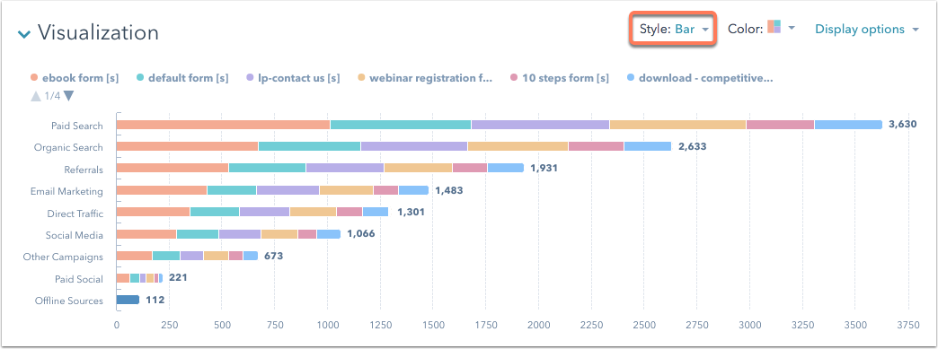
1. Bar
A bar graph is used to highlight the comparison of multiple metrics with each other. For example, you can compare how multiple ebooks performed against each other. In the custom report builder, this type of chart is called a horizontal bar chart.
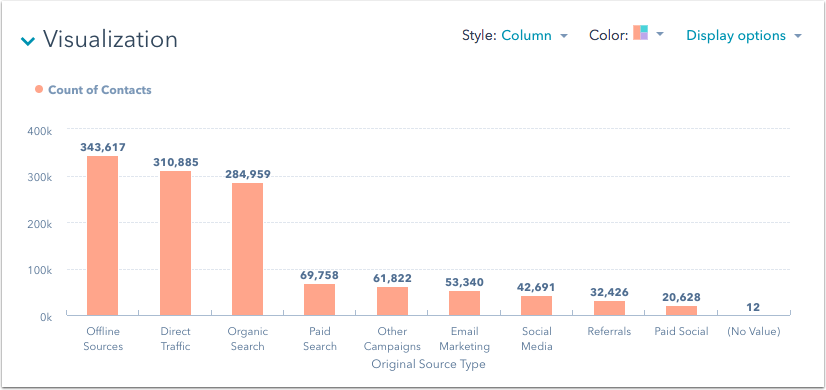
2. Column
A column graph highlights how multiple metrics compare to each other. For example, you can see how many contacts you generated from different marketing channels. If you have a large amount of data, a column chart may be a better option than a bar chart. In the custom report builder, this type of chart is called a vertical bar chart.
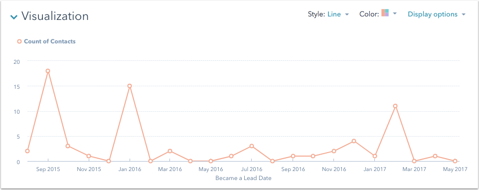
3. Line
A line graph is used when you want to show the growth of a metric over time. For example, use a line graph to display the growth of your contacts over time.
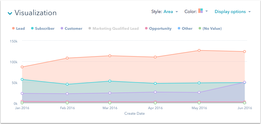
4. Area
An area graph of HubSpot graphs is used to show multiple data sets and their relative growth over time in comparison to each other. You can see how each data set grew individually, but also how they added to your metrics as a whole.
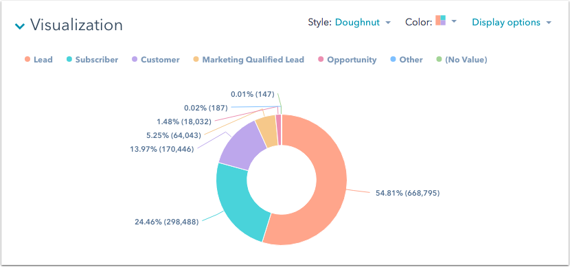
5. Donut
A donut chart is used when you want to display a metric breakdown. For example, use a donut chart to see a breakdown of your total contacts by lifecycle stage.
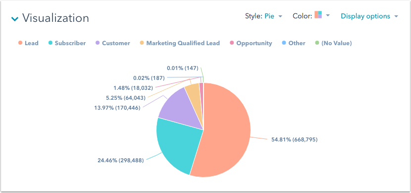
6. Pie
A pie chart is used in the same manner as donut charts. They help to display a breakdown of a metric. For example, use a pie chart to see a breakdown of your total contacts by lifecycle stage. A pie chart will display a maximum of 25 sections at a time.
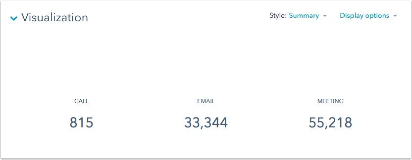
7. Summary
The summary graph gives you a quick snapshot of your data by displaying exact metrics. For example, if you want to keep track of how many calls, emails, or meetings your sales reps have placed during a given time period, you can set up an engagement report using the count of engagements and type.
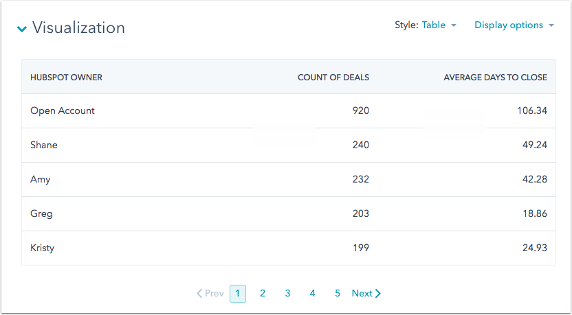
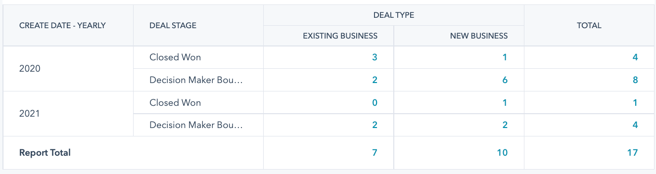
8. Table
A table graph variation of HubSpot graphs displays your data when it is important to see exact numbers for multiple metrics together, and not just general trends. For example, use a table to see the number of deals by the deal owner, along with the average days to close.
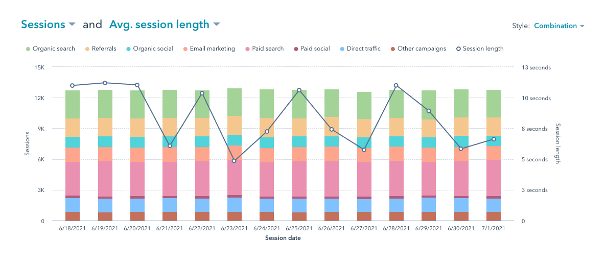
9. Combination
A combination chart is used to compare different metrics in the exact visualization. A combination chart consists of two Y-axes visualized with a bar chart and a superimposed line chart. For example, use a combination chart to compare website sessions and average session length.
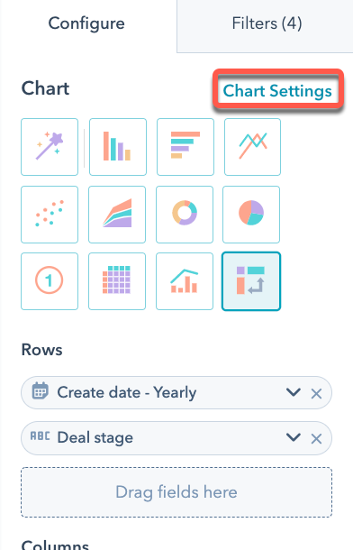
10. Pivot table
In the custom report builder, the pivot tables are used to group, compare, and summarize larger sets of data. When using pivot tables you can have up to four properties in both the rows and columns sections. For example, use a pivot table to compare the count of page views and the count of deals by lifecycle stage of contacts who became leads starting from January 2020.
To view subtotals in your report, click Chart settings, then select the Show subtotals checkbox.
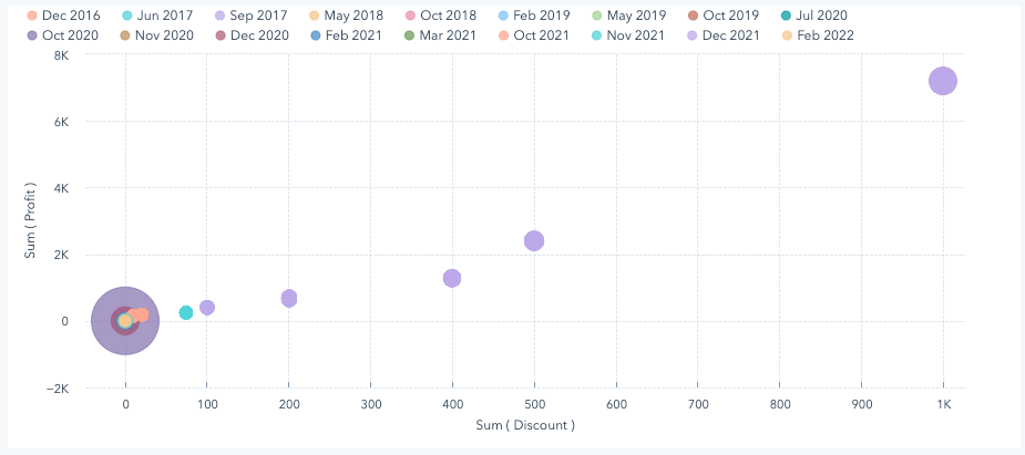
11. Scatter plot
A scatter plot chart type option is available in HubSpot’s custom report builder. You can select and use the scatter plots for viewing relationships between data across multiple variables instead of just the x-axis and y-axis. Scatter plots can highlight trends, clusters, patterns, and relationships between numeric data. For example, you could create a scatter plot to report on whether or not providing a larger discount leads to great profit.
In scatter plot charts, you can only add measures and date-based fields to the X- and Y-axes. Any field you add to these axes will be converted to a measure automatically. Learn more about dimensions versus measures.
Overall, HubSpot graphs and reporting give you a free hand to build customized reports using either one or a combination of more than one chart type to derive accurate and effective information from your website’s data. Hence, giving you ample opportunities to leverage that information for better growth.
